Auditing Your Online Booking Funnel for Drop-Off
You're losing clients between slot selection and confirmation—here's where the leaks are.
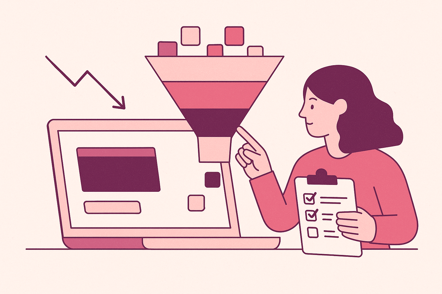
Most booking funnels lose people between "here's an open slot" and "you're confirmed," and the gap is almost always three things: the deposit ask, the intake form, and a confirmation message nobody reads. If you run a service business (salon, med spa, dental, therapy practice, whatever), this is the part of your website nobody audits because it "already works." That assumption is wrong. It fails quietly.
Here's the thing about funnel drop-off: it doesn't announce itself. Nobody emails you to say "your deposit page made me nervous, bye." They just close the tab. You find out three weeks later when you're staring at a calendar with more holes than a golf course and no idea why.
The Slot-to-Confirmation Gap Is Wider Than You Think
Picture the path a new client takes. They Google your business, land on your site, click "Book Now," pick a time that works, and then... stuff happens. Forms. Payment fields. A "please confirm via text" message that lands in a spam folder next to a Nigerian prince's investment opportunity.
Every one of those steps is a tollbooth. And tollbooths, as anyone who's driven through New Jersey knows, are where traffic stops moving.
The moment someone sees an available slot, they've made a decision: they want in. That's the emotional peak of the whole interaction. Everything after that point is friction working against a decision they already made. Your job is to get out of their way.
Deposit Friction: The Toll Booth Nobody Budgeted For
Deposits are necessary. No-shows cost real money, and asking for a card on file is a reasonable defense. But the way most booking systems ask for deposits turns a two-second decision into a four-minute interrogation.
Watch what happens on a lot of booking pages:
- Client picks a time slot.
- Client gets redirected to a separate payment page that looks like it was built in 2011.
- Client is asked for a deposit amount that was never mentioned anywhere on the original service listing.
That last one is the killer. Nothing kills momentum faster than a surprise. If a haircut is advertised at $65 and suddenly there's a $30 deposit demand with zero context, the brain does what brains do: it gets suspicious. Is this a scam? Did I misread something? Should I just call instead?
The fix is tedious to implement, but simple: state the deposit amount, and the reason for it, on the same page where the time slot gets picked. Right there, next to the calendar, in plain language: "A $30 deposit holds your spot and goes toward your service." One sentence. Problem solved.
Also, and this one's almost comically overlooked, make sure the payment processor doesn't require an account creation. Forcing someone to build a login just to pay a deposit is like asking someone to sign a lease before they're allowed to test-drive the apartment. They're not doing it. They're leaving.
Intake Forms: Where Enthusiasm Goes to Die
Intake forms exist for good reasons. Medical history, allergies, liability waivers, all legitimate. But most intake forms are built by whoever had five minutes and access to the software, not by anyone who's ever tried to fill one out on a phone while standing in line at Trader Joe's.
Here's an anecdote that'll sound familiar to anyone who's run a wellness business. A client named Rachel books a deep-tissue massage for a Friday evening, thrilled to finally do something nice for herself after a brutal week. She clicks the confirmation link on her lunch break, expecting a quick tap-tap-done. Instead, she's met with a fourteen-field intake form asking about surgeries dating back to childhood, a dropdown menu with thirty scroll options for "how did you hear about us," and a signature field that refuses to render on her phone's browser. She tries three times, gives up, and tells herself she'll finish it "later, from a laptop." Later never comes. Friday arrives, Rachel doesn't show, and the massage therapist spends the empty hour wondering what went wrong, when really, nothing "went wrong" so much as nothing ever got finished. It's like inviting someone to a party and then handing them a background check at the door.
A few fixes that actually move the needle:
- Cut the form down to what's medically or legally necessary. Everything else can wait until they're in the chair.
- Split long forms into short screens instead of one endless scroll. Progress bars help, too; people finish things they can see the end of.
- Test every form on an actual phone, not a laptop. Most bookings happen on mobile, and plenty of intake tools were clearly designed by someone who's never once tried to type an address with their thumb.
None of this is rocket science. It's just unglamorous enough that everybody puts it off until "sometime later," and later never arrives, just ask Rachel.
Confirmation Messages: The Silent Killer
This is the one that gets ignored the most, mostly because it feels like the finish line. Client booked, client paid the deposit, client filled out the form. Done, right?
The confirmation message is the last handshake before the appointment actually happens, and a bad one undoes all the work that came before it. Think of the confirmation like the last handshake at the end of a job interview: firm and clear, and the person walks away confident. Weak and mumbled, and they spend the drive home wondering if the whole thing actually happened.
Common problems, and they're everywhere:
- A confirmation email that lands in spam because it was sent from a no-reply address with a subject line that reads like a phishing attempt.
- A text confirmation with no way to reply or reschedule, so the client's only option if something comes up is to just... not show. Silently. Like a ghost, except less spooky and more expensive.
- Zero reminder before the appointment, so the client forgets, because humans forget things, that's what we do.
Treat the confirmation message like a conversation, not a receipt. Send it from an address that looks human. Include a name, a phone number, a way to text back. Follow up 24 hours before with a reminder that includes a one-tap reschedule link, because half of your no-shows aren't people ghosting you, they're people who genuinely forgot and would've rescheduled if you'd made it a two-second task instead of a phone call during business hours they can't take.
Quick question for you: what do you call a client who never got a reminder text? Gone. That's the whole joke, and it's not funny when it's your calendar.
How to Actually Audit This Yourself
Forget assumptions. Book an appointment with your own business, right now, like a stranger would. Use a personal email you never check. Use your phone, not your desktop. Time yourself.
If it takes you more than two or three minutes to get from "available slot" to "fully confirmed," that's your answer. Every extra minute is a door left open for the client's brain to talk them out of it, and brains are remarkably good at finding exit ramps when given the chance.
Check your actual numbers, too, not vibes. Most booking platforms track how many people start a booking versus how many finish one. A number like that demands attention, but don't panic. Just start peeling back the layers: deposit page, intake form, confirmation flow, one at a time. You're usually looking for three small annoying things stacked on top of each other, rather than one big broken thing.
The Bigger Point
Booking funnels don't fail because businesses don't care. They fail because nobody in the building has sat through their own intake form on a cracked iPhone screen with one bar of signal. The fix is a series of small, boring adjustments: clearer pricing, shorter forms, warmer confirmations.
Do that, and the gap between "available slot" and "confirmed appointment" stops being a leaky faucet and starts being what it should've been all along, a formality.